SantéVet website revamp
Simplifying insurance signup and checkout to enable a faster, fully online subscription experience.
- Client
- SantéVet
- Year
- 2024
- Role
- Lead Product Designer
- Duration
- 5 months
Context
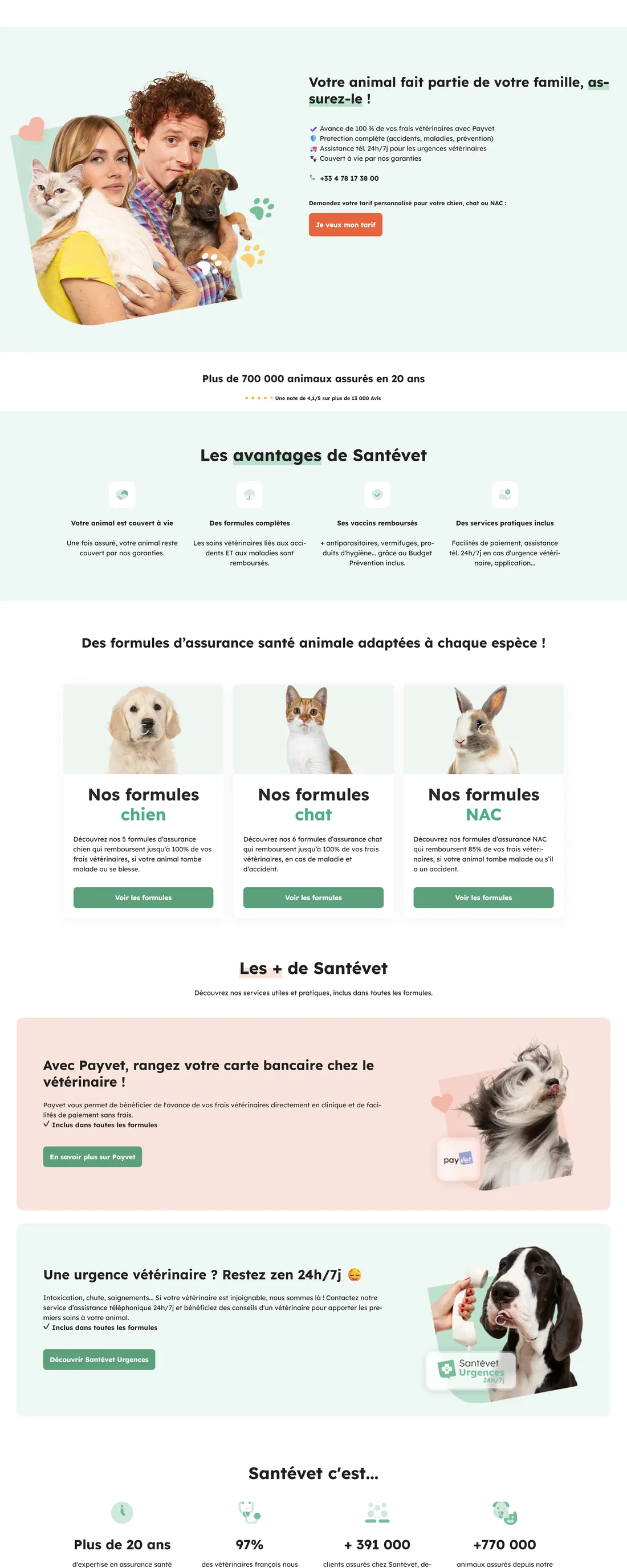
The goal was to transform an outdated pet insurance website into a modern, conversion-driven experience. The product needed to support users in selecting and subscribing to insurance, simplify complex decision-making, and work seamlessly across devices. However, the experience was fragmented, complex, and not optimised for conversion.
The problem
The existing experience created major friction: a long and complex signup flow with 10+ steps, users required to go through telemarketing to complete subscription, limited flexibility (one pet at a time), and unclear coverage and options. The result was users dropping off before completing their subscription.
Discovery
Methods
- Analysed user flows and drop-off points across the signup funnel
- Identified friction across signup and checkout steps
- Reviewed user decision-making behaviour around plan selection
- Facilitated workshops to align product direction with stakeholders
What I found
Too many steps slowed down completion. Requiring telemarketing broke the user journey at the most critical moment. Lack of flexibility (one pet only) increased frustration. Unclear information about coverage and options reduced trust and confidence.
Key insights
Too many steps slowed down completion
Each additional step introduced another opportunity to drop off. Streamlining the flow to the minimum necessary steps dramatically improved completion rates.
Requiring telemarketing broke the journey
Users expected a fully self-serve experience. Forcing them into a phone call at the point of commitment destroyed momentum and trust.
Lack of flexibility increased frustration
The inability to add multiple pets in a single flow was a top complaint. Removing that constraint opened up a key user segment.
Unclear information reduced trust
Users needed to understand exactly what they were covered for before committing. Adding clarity at the decision point improved confidence and conversion.
Strategy
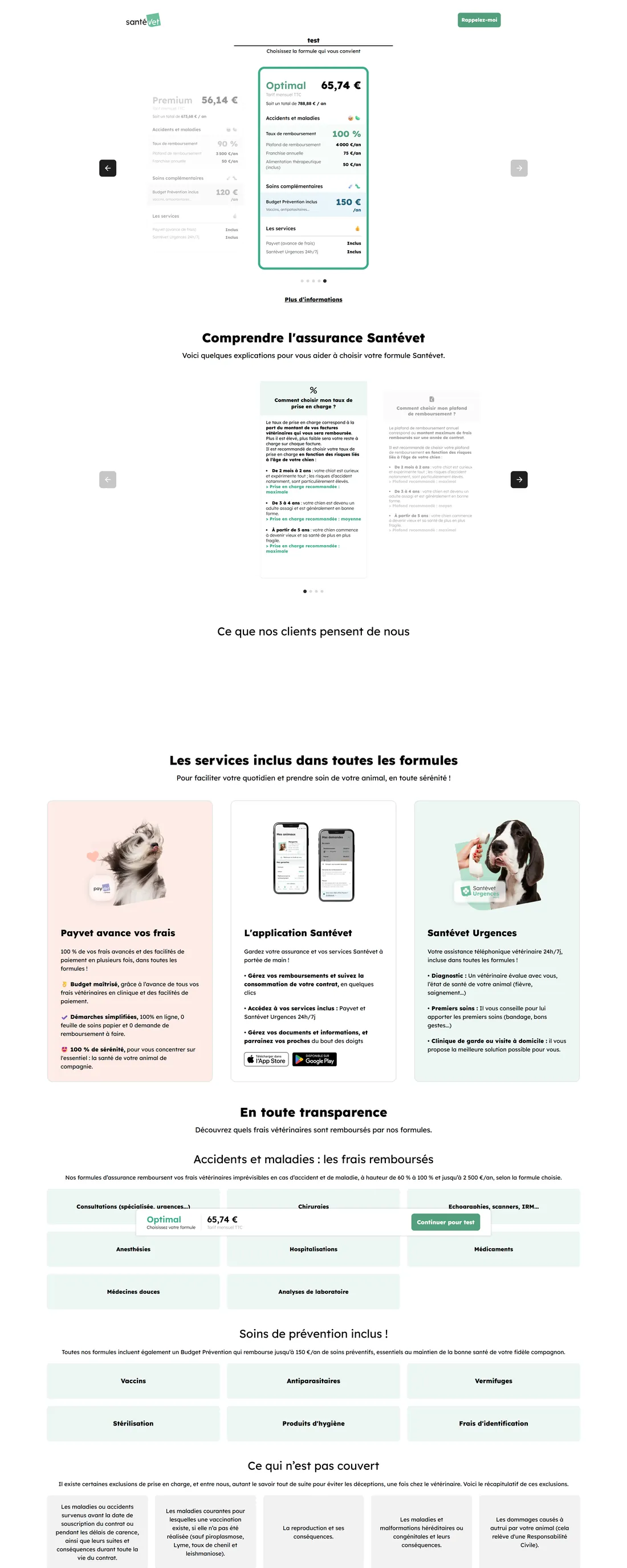
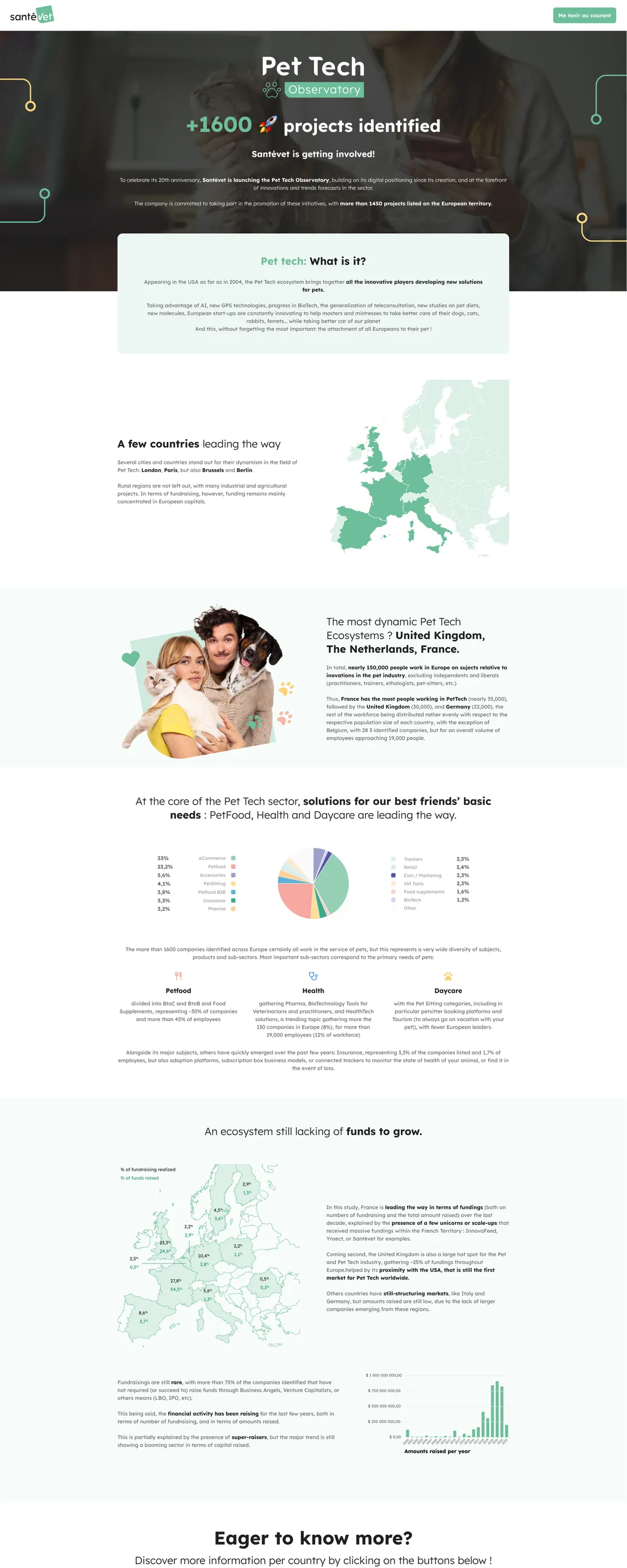
Reduce the number of steps, enable full online subscription without any telemarketer intervention, simplify plan decision-making, introduce flexibility with multi-pet support, and improve clarity on coverage and options.
Product decisions
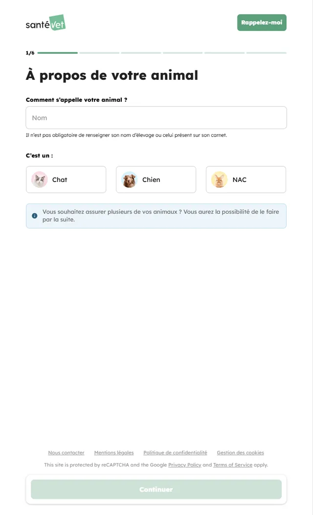
- 01Reduce signup flow from 10+ steps to 6 clearly structured steps
- 02Enable 100% online subscription, no telemarketer required at any point
- 03Redesign plan selection to simplify decision-making
- 04Introduce multi-pet support within a single subscription flow
- 05Improve payment flexibility and coverage transparency
Execution
Led UX strategy, research, and design from discovery to delivery across a 5-month engagement. Every flow was validated against drop-off data and tested with real users before shipping.
What shipped
- 01Reduced signup flow from ~10 steps to 6, progress bar visible throughout
- 02Redesigned checkout and form experience for clarity and speed
- 03Enabled full online subscription, no telemarketer at any stage
- 04Introduced multi-pet support within a single checkout flow
- 05Improved payment flexibility and coverage explanation at point of decision
Impact
The revamped website reduced friction across every stage of the signup journey. Users could now complete their subscription independently, faster, and with more confidence.